


.png)
.png)
.png)


LinkedIn Image Sizes: Make Every Pixel Count
- Tsamarah Balqis
- Aug 25, 2025
- 4 min read

Updated: May 30
In today’s visually driven digital world, your brand’s identity is communicated in more ways than just words and nowhere is that more apparent than on LinkedIn. This professional platform isn’t just a resume warehouse anymore. It’s a place where businesses, creators, and brands showcase their personality, credibility, and offer value at every scroll.
For creative brands in Singapore, particularly those in design, media, and digital production (hello, fellow storytellers), LinkedIn is where first impressions must be visually sharp. That’s why understanding the correct image sizes for LinkedIn and designing with purpose is essential.
This isn’t just about uploading a nice banner. It’s about ensuring your content marketing agency, cohesive, and impactful no matter who’s viewing it or what device they’re using.
Welcome to your full guide to LinkedIn image sizes, brought to you by Paper Cut Collective. Let’s help you optimise your presence with both precision and personality.
Why LinkedIn Image Sizes Matter More Than You Think
LinkedIn isn’t Instagram advertising agency singapore but that doesn’t mean it’s any less visual. It’s where decision-makers hang out, where your next collaborator or client is silently judging your design standards, and where your banner and post images often speak before you do.
When your images are incorrectly sized, poorly cropped, or pixelated:
You look outdated or careless.
Your visual storytelling is cut short literally.
Your key messages (text overlays, taglines) get hidden or distorted.
On the flip side, when your images are sized correctly:
You look professional and detail-oriented.
Your brand visuals remain sharp and aligned across mobile and desktop.
You capture more attention (and clicks) from a busy, scroll-happy audience.
Think of it like this: your LinkedIn visuals are your digital handshake. And no one likes a limp, blurry handshake.
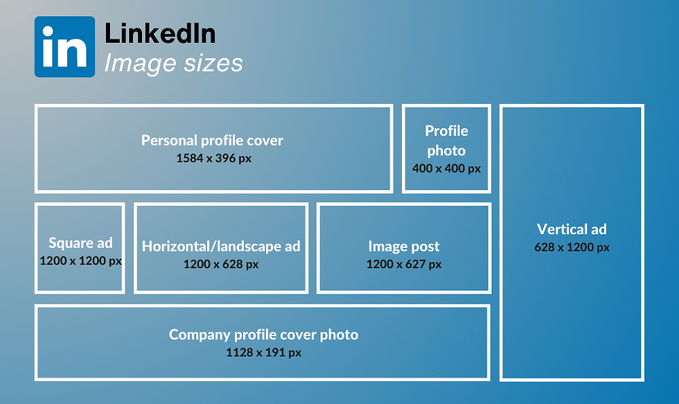
The Essential LinkedIn Image Sizes Cheat Sheet (2025 Edition)
Let’s break down the most common LinkedIn visual placements, their ideal sizes, and some creative tips along the way.
Placement | Dimensions (px) | Creative Tips |
Profile Photo | 400 x 400 | Use a clean headshot with even lighting. Make sure the face is centred LinkedIn crops in a circle. |
Personal Cover Banner | 1584 x 396 | Leave a 150px buffer on each side for safe zones. Avoid placing text too far right or left. |
Company Logo (Profile) | 300 x 300 or 400 x 400 | Use a high-resolution version of your logo with a transparent or brand-colored background. |
Company Page Cover | 1128 x 191 | Think minimalist here. Wide, short banners require strong composition and a clear focal point. |
Shared Image Posts (Square) | 1200 x 1200 | Great for quotes, stats, or short promos. Center key text. |
Shared Image Posts (Landscape) | 1200 x 627 | Ideal for blog or article previews. Use text overlays sparingly. |
Shared Image Posts (Portrait) | 1080 x 1350 | Portrait content works better for mobile-first users. Ensure top-aligned focus. |
Carousel Posts | 1080 x 1080 | Keep each frame visually consistent. Think: narrative flow. |
Article Cover Image | 1920 x 1080 | Choose clean, editorial-style visuals. Avoid cluttered design. |
Life Tab Banner (Company) | 1128 x 376 | Feature brand culture or lifestyle photography. Great for employer branding. |
Life Tab Module Images | 502 x 282 | Use simple icons or product snapshots. Ensure text is readable at small sizes. |
Company Photos (Gallery) | 900 x 600 | Use event shots, team photos, or community moments. Prioritize lighting and composition. |
How to Creatively Leverage These Sizes
Now that we’ve handled the specs, let’s make them sing. As a visual production agency, we believe great design isn’t just about “correct” it’s about compelling.
Here are some style tips to elevate your LinkedIn visuals:
1. Safe Zones Are Non-Negotiable
What looks perfect on desktop may get cropped on mobile. Always preview your banners and posts across devices. Especially for banners, keep essential visuals centred.
2. Consistency Creates Trust
Use your brand colours, typefaces, and tone consistently across all visual placements. This tells visitors you’re not only visually aware you’re brand aware.
3. High-Resolution Only, Please
Nothing breaks trust like a blurry logo. Always upload retina-ready versions of images and use PNG for logos or illustrations, JPEG for photography.
4. Minimalism Wins
Especially on banners and cover images. Less is more when it comes to copy and clutter. Let your brand speak through whitespace and composition.
5. Use Templates for Posts
Design a few repeatable post formats for announcements, blog shares, or quotes. That way, your feed always feels curated, not chaotic.
Common Mistakes We Fix (All the Time)
Let’s be honest, most LinkedIn pages suffer from the same visual faux pas:
Text-heavy banners that get cut off or become unreadable on mobile.
Inconsistent post styles that confuse viewers about what the brand actually does.
Low-res uploads (yep, LinkedIn compresses your files further, so start high-quality).
Mismatched fonts and colors that don't reflect the brand’s actual website or tone.
If any of these sound familiar don’t worry. That’s where we come in
How Paper Cut Collective Helps You Look Sharp on LinkedIn
We help purpose-driven and creative brands translate their visual identity into every pixel.
Whether you're starting from scratch or revamping your LinkedIn, we bring a blend of design expertise + platform strategy to every project.
Our LinkedIn creative services include:
Custom profile and banner design for founders and brands
Scroll-stopping post templates (static, carousel, and animated)
Campaign-specific visuals for product launches or announcements
Visual audits to clean up inconsistent brand assets across your feed
Ready-to-edit Canva templates for you or your team to use easily
Whether you're a design-forward startup, content creator, or agency we’ll help your LinkedIn feel just as curated as your website.
Wrapping Up: When in Doubt, Design With Intention
Your LinkedIn presence isn’t just a resume or digital listing it’s part of your brand ecosystem. And your visuals? They do a lot of heavy lifting.
When you respect the technical specs, align with your brand guidelines, and tell stories through imagery, you create a feed (and a profile) that attracts the right audience without having to say a word.
Ready to Make Your LinkedIn Visually Unforgettable?
Let’s design your profile banners, post templates, and LinkedIn visuals with as much strategy as style. At Paper Cut Collective, we turn every scroll into a brand moment.
👉 Visit papercutsg.com and book your LinkedIn Visual Refresh today.
Because on LinkedIn, you don’t just want to be seen you want to be remembered.


